Microsoft Word is a frequently used format in State Government. Word provides a flexible environment where it is easy to make documents accessible. You can enlarge text easily, save it to different formats and create audible or Braille documents from Word documents if prepared properly.
Styles
Styles is a feature in Word which is probably your strongest tool. Styles allows you to label or "tag" how blocks of text are formatted (earlier versions of Word called it "Styles and Formatting"). Using this feature can greatly increase the readability of a document for both sighted and visually impaired readers. It can also be an incredible productivity tool by reducing the time it takes to format and re-format text.
Using styles, text is classified by its purpose. A main header would be Heading 1, while a sub header to that would be Header 2 and so on. There are styles for bullets, lists, text, graphs, bold and an assortment of other styles.
By using Headers (Heading 1, Heading 2 etc.) it allows screen reader users to scan through the document for the various sections. Much as a sighted user would visually scan for large headers and sub-headers, many screen readers have the ability to jump from header to header allowing a visually impaired user to also "scan" the document.
A bonus to using Styles is the ease of formatting a document. As each style's features are pre-set, there's no need to remember that Header 1 is 14-point font in bold Arial. When you tag it as a Header 1, it'll automatically apply all of the appropriate formatting to the text. This will save you time and create a consistent, readable and accessible document. If you later decide that you want a style to be different, you update the style and every instance of that style will be updated throughout your document. Another bonus is that Word can use these headers to create a table of contents for your document. (See below for more information.)
- Styles is visible on the home ribbon and can be accessed from there
- On a new line, select the style you want and begin typing. Alternately, highlight existing text and select the appropriate style
- Modify a style by right clicking the style in the ribbon and select Modify. From here, you can change the look of the style including font size, style, bold/italic as well as line spacing. Alternately, create text and style it manually, then right click on the Style in the ribbon, select "Update (style name) to Match Selection". This will update the selected style to your current selection.
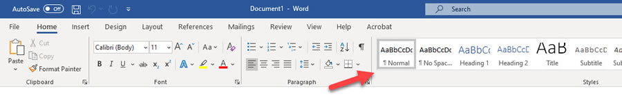
Table of Contents
Word uses headers to generate a table of contents (TOC). As your document gets updated or new sections added, the TOC can be refreshed to show the next sections. No need to count pages and manually write a TOC.
Begin by adding headers to your document. Place your cursor where you want your table of contents. Go to "References" tab and select "Table of Contents" on the left-hand side of the ribbon. Select the style of TOC you want and it'll insert the table of contents. Here you can see whether your headers are consistent in terms of their labels and whether they make logical sense. By default, the TOC shows three layers of headers, but you can reduce this by selecting the "Table of Contents" button again and select "Custom Table of Contents". This will open a new window and there's a setting "Show levels" where you can reduce this to 1 or 2 levels.
Pictures / Images / Graphs
Pictures can add texture and clarification to your reports and presentations; however, they are inaccessible to those who are visually impaired and using a screen reader.
To make sure everyone can access the images and graphics in your materials, you'll need to fully explain information contained in graphics and images. These descriptions of the image are placed in the document and are called alternative text or "alt text" and are not visible. In electronic format, screen readers will recognize when alt text is present and read it to the user. This communicates to the listener contents of an image. In the absence of alt text, the screen reader user will know there's an image, but not know what the image is or its relevance to the document.
For more information on alternative text, see Accessibility Guide's Images and Graphics page
Tables
Tables provide an excellent way to organize information. A screen reader reads a table from left to right and top to bottom. Because of this you should avoid merged cells and consider how you're laying out information so it can be understood.
Tables should be used for data only and never for layout purposes.
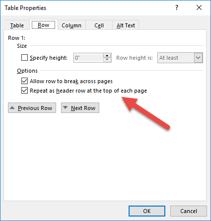
Table Properties > Row > and select the check box next to "Repeat As header row at the top of each page". Do this regardless of whether your table spans multiple pages because it allows a screen reader user to tell what column they're in, regardless of what row they're in.
| First Name | Last Name | Town of Residence |
|---|---|---|
| John | Doe | Acton |
| Jane | Small | Waterboro |
| Hamza | Ibrahim | Kingfield |
Text Boxes
Text boxes should be avoided. They are frequently used for layout in Word, especially for event flyers or announcements because they allow the user to tilt words or make overlapping arrangements of pictures and text.
Even with alternative text they are inaccessible as screen readers cannot navigate into text boxes, making the content in them invisible.
An alternative to text boxes is to insert a picture and use the formatting to wrap text around the picture and add alternative text. This will allow a screen reader to "see" the picture and communicate the content of it and continue on with the text. Do this by right clicking the picture and choosing Format Picture. Here you can set how the text wraps around the picture and add alternative text.
Links
Hyperlinks in documents (and webpages) should be clear and concise description of where a link goes rather than displaying the actual link. Screen readers read out that it's a hyperlink and then what the link says.
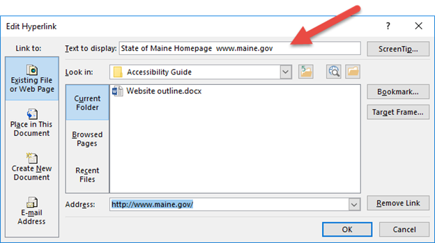
Creating a link in a Word document is quite simple as Word recognizes when you've entered information which looks like a link and automatically formats it as a clickable link when you hit the space bar. You can then edit the link by right clicking on it and selecting "Edit Hyperlink".
You'll be presented with an editing window where you can change the "Text to Display" field to be descriptive of the link. So rather than www.maine.gov you can put in "State of Maine homepage". Do not use "Click here" as your description as it is not descriptive of where the link goes.
If you're intending a document to be printed and used electronically, combine the two techniques by having descriptive link and the full URL. This will allow the screen reader user to hear where the link goes first and can skip off before listening to the URL and those using a printed version to see the actual link. For example State of Maine Homepage
Accessibility Checker
MS Word also has an accessibility checker built into it. However, because it tests only for certain things, you should use it as a screening tool only and not the final determining factor on whether your document is accessible. For example, it determines only whether alternative text is present, but not whether that text is accurate. The Accessibility Checker can be found on the Review tab, then "Check Accessibility".